Monday 2 May 2011

7. Looking back at your preliminary task, what do you feel you have learnt in the progression from it to the full product?


Creating my school magazine helped me anticipate what I would need to do for my final product and I found it very helpful. 
My final product is very different from my preliminary task. I wanted my final piece to be amazing compared to my first one, which I feel I have done. I purposefully tried to outdo myself on my music magazine and I am very happy with the result. I have learnt to pay more attention to detail and to be more spacialy aware 

6. What have you learnt about technologies from the process of constructing this product?

During the creation process, I was able to experiment with some technologies which i have never used before. 
To take my images, I used my personal digital camera, which I am very familiar with. 
I then used Photoshop Elements 8 to manipulate my images. I had this programme on my personal laptop so I had the chance to really find out what it could do which helped me alot.
I then used Adobe InDesign to create my actual pages. The huge variety of elements avaliable was very educational for me, as i got to do things I was unable to do on any other programme.
Paintshop Pro allowed me to manipulate my images such as removing and replacing backgrounds, changing colours and much more.
I have learned alot about magazine production and how much technology is needed to produce a page

5. How did you attract/address your audience?

For my magazine planning, attracting my audience was mostly research based. My reader profile is very similar to myself, so I used that as a base. I looked through tons of different types of music magazines to see which ones drew me in and made me want to read it. I found that bands on covers attracted me alot, so I used that on my cover. The colour red also came up alot, and was common in the better magazines which I would want to take elements from. 
On my double page spread, i kept the red theme going, and took the 'personal experience' route. The articles that affected me most were ones I could relate to as a music fan, and I wanted to create that sense of empathy with my audience. It almost creates a relationship between the magazine and the reader, or even between readers and other readers.
My contents page had to be busy. I found that bland contents pages were very ineffective and I tended to overlook them easily. I wanted to make it busy but clear, and I think I did that. A neat page anywhere in my magazine really would not have expressed the personality of the readers I was trying to reach.

4. Who would be the audience for your media product?

3. What kind of media institution might distribute your media product and why?

The distributor of a magazine is responsible for maximising magazine sales in the most cost-effective way. They have to understand the audience in order to develop effective strategies for driving category sales.

My researched distributer is Frontline. Frontline distribute over 180 of their partner’s magazine titles, including 70 of the top 200 best selling titles in the UK and are the biggest magazine distributor in the country. My magazine would be transferred from the publication to the wholesaler through distribution.


By becoming a brand of their own, 'This Is Suffering' could secure a trusting and loyal audience through the distribution of any magazine they choose to feature in.

2. How does your media product represent particular social groups?

In my audience profile, I said i aimed to reach people who like attending gigs and concerts, and get excited about local music, whilst embracing legendary creations. I feel I have reached these people in my images, text, layout and colour scheme.
Though the main image of my cover is all male, I used subsidary images including females to make it appeal to both genders. 
the colour scheme is prodominantly red, white and black, which i feel appeals to everybody who enjoys live and local music. 
 

My article is very personal, and I thought that the reader could easily read and relate to it, even though they were not there. I tried to generalise experiences and interests to appeal to my target audience, such as going to gigs. My masthead 'TIKIT' is meant to reach anybody who goes to live events, which is the group of people i am mostly trying to attract.


1. In what ways does your media product use, develop or challenge forms and conventions of real media products?

 The Front Cover.


I feel my front cover is quite conventional in comparison to other music magazines that I have researched and studied. My main image, I feel, challenges forms and conventions by using a live 
action shot of the band, whereas generally in magazines, there is a posed shot of the band offstage. As a live music magazine, I think this image is appropriate to the subject. I have included features such as banners at the top and bottom of the page. This is generally common within all magazines, and helps the page flow like a real product. Other features such as posters and competitions gives the feel of a more traditional magazine, with the main image being the exception. Small details have been paid attention to, such as barcodes, issue numbers, prices etc. This also adds to the feel of this being a traditional music magazine. I have taken inspiration from several different magazines, some of which are shown below.


Double Page Spread.
I tried to create a new sense of exploration with my double page. As the article was about personal experiences from the view of a journalist, I thought a scrap book theme would be appropriate. I placed my images carefully to create a homely feel and help the reader relate to the article. 

  I tried to add small details such as page numbers and email addresses to make it more conventional. I used my masthead idea to make my page numbers, which I think has worked really well. I used bold, coloured writing in my article to emphasise parts of it that could possibly further engage the reader. I have seen this used in magazines before and thought it was a good element to include. I also saw the idea of the huge letter at the start of the article. I think this gives a depth to the page, and makes it look more like a real magazine. I included a snappy title for my article, which I think works well with the images and the article. Below are some examples of magazines I took inspiration from.


Contents Page.


I think my contents page is the most conformative of all of my pages. I tried to keep as much to forms and conventions as i could to make it look as real as possible.


  These pages were mostly inspired by Q magazine. I tried to add every detail possible, such as names, email addresses, page numbers and even borders. The images, I feel, are placed well and it looks full and busy without looking cluttered and confusing. Below is a page i used as inspiration.


Contents Page. Version 3

 
this is the final version of my contents page. i think it flows well and is easy to use, without being too cluttered. I am very happy with these pages

Contents Page. Version 2


in this version i included more elements on the left of the double page, adding another article and subsidary image which i think suits the page.

Contents Page. Version 1

 
This is the first version of my contents page. I took inspiration from Q magazine and tried to add as many new elements as possible, such as my personal masthead and image.

'Tikit' Front Cover, Attempt 2, Version 5

This is the final version of my second cover, which I will be using as my final product. I added more subsidary images to the sell lines to make the page more interesting for the consumer. I also took inspiration from 'Q' magazine and used a plus sign to point out more factors included in the magazine. I am much more comfortable with using this version of my cover, as I feel it is more conventional and generally looks more appealing.

'Tikit' Front Cover, Attempt 2, Version 4

Here, I added a subsidary image to the bottom of my page, acting as a poster that can be found inside the magazine. I also added a banner to the bottom to explain the image to the reader.

'Tikit' Front Cover, Attempt 2, Version 3.

Here, I added a banner to the top of my page to try and conform to the layouts of other magazines. I also added a competition reference to expand what could be inside the magazine, and to make the best of the avaliable space.

'Tikit' Front Cover, Attempt 2, Version 2

I decided the black background was too harsh for my cover, so decided to fade it, and lighten it up slightly. I also added another sell line and tried to decide where would be best to place other ones.

'Tikit' Front Cover, Second Version

After looking at my first attempt of my Music Magazine Cover, I decided to make it a more conventional piece by changing key elements to make it more like a traditional magazine. My masthead, I thought, was too outrageous in terms of its placement and delivery, so i used the design to make a more regular masthead, using the original image as the letter 'I', as not to waste it. I changed the main image to one where more of the band is visable, to give a clearer understanding of the purpose of the image. I changed the background colour to something I could more easily adapt to and change throughout the editing process, and I played around with ideas for the presentation of the sell lines.

Tuesday 8 March 2011

Contents Pages I Love

I


I think this page works really well, even taking into consideration the lack of subsidary images. The amount of text on the page looks daunting at first, but then you look closer and see how much the magazine really has to offer within the covers. The band index is really helpful for people who are looking for a particular style or band.

Contents Pages I Love

 
I absolutely love this contents page! I think it includes everything a contents page should have, and it still looks so organised yet interesting. There are plenty of varied images which are relevant to the articles, and it includes clear page numbers to direct the reader. Im hoping my contents page will look as good as this one.

Wednesday 16 February 2011

Comments on my headline by classmates

"I love the headline! sounds very professional!''

"The headline is very catchy and is a play on the bands name This Is Suffering. Very good!"

Double Page Spread Article


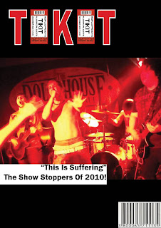
This is Music. This is Pride. This is Suffering!

THIS IS SUFFERING IS THE BEST NEW BAND TO ENTER THE LIVE MUSIC SCENE IN THE LAST YEAR.
Formed in the small Welsh town of Tredegar, the boys have gone from strength to strength with their 3 track EP flying of the shelves of local music stores. In the summer of 2008 the band came together as the result of a night out and an amazing musical epiphany. Jordan Davies (lead vocals) met with his friends Mike Price (drums) and Aled Davies (rhythm guitar) for a typical Saturday night out in Tredegar. They were later joined by friends Sam Kilby (lead guitar) and Matt Indge (bass) and went to a music bar where they jammed as a group for the very first time. The cheers and praise kept coming as they spat out more and more musical magic as if they had been practising for days. That Night, This Is Suffering Was Born.
The first time I ever saw This Is Suffering was at my favourite bar, Hobo’s, in Bridgend. I went in after hearing there were fresh blood bands giving their hand at the trade that night. I paid my £3 and went upstairs to the bar to check out the new sounds, but all I heard was the same old stuff. A bit of shredding, a bit of double bass. Just as I was ordering another beer from the overcrowded bar, the silence was punched in the face by a gut wrenching scream over the sound system. It was special. Something about it made me shut up and listen… and I liked it! As the guitars came in I felt a shiver shriek through the depths of my spine, and I made my way to the front of the crowd. Who WERE these people! I hadn’t had this feeling since the first time I ever heard Bullet For My Valentine (also a local Bridgend band). As I listened on, the feeling I had was taking over the room. More and more people came to see who was making this amazing music, and for the first and only time of the night, a mosh pit was formed. They had really done it. It was EPIC! They did a set of 3 perfect songs. I can still remember them all. First was ‘Who’s The Monkey Now?’ followed by ‘Epic Fail!’ then ended with my personal favourite… ‘Disaster’. I NEEDED to see these guys again. 
‘’They had really done it. It was EPIC!’’
After their set I approached the singer (admiringly, like a child meeting Elmo!) and started talking to him about his band and found out their names and other stuff. When the bar we were at closed we decided to go out to a nightclub where we laughed and drank all night till we decided to call it a night (or do you say ‘call it a morning’ at 3am?). I asked for his facebook, as asking for numbers is kinda pointless nowadays. Jordan Davies. I got home. I searched. When I heard the band had an EP out in stores I went straight out to buy it, and it turned out to be one of the best buys I’ve ever made (and being in music journalism… I buy A LOT).  I couldn’t stop thinking of the songs I had previously heard at the club.
‘’…it turned out to be one of the best buys I’ve ever made’’
They kept going round and round in my head like the go compare ad but less mind numbing. The disc remained in my car for weeks till I knew every cleverly crafted word and riff which constructed the song.  Disaster was still my favourite song! I found that the boys were playing some venue in Pontypridd so I Google mapped it and made my way along with my best friend. I was so excited to get that rush all over again, so I wasted no time in getting right to the front! It was like a drug to me. My own personal brand of heroin.  
The lights went down and the volume cranked up. My friend Naomi was sceptical but once she heard exactly what I heard that very first time in Hobo’s, her eyes lit up just like mine did. Jordan did his usual, jumping around on the amps and climbing onto the bass drum, nearly killing Mike! Sam did an amazing solo for their second song, twanging the top of the strings with his pick like Hendrix himself.  Matt took the form of Flea, next to Aled who ripped up the stage in the style of the almighty Slash! It was even better than the first time, if that’s possible.  I remember one gig at the Cardiff International arena where This Is Suffering was supporting Bring Me The Horizon.
‘’Aled ripped up the stage in the style of the almighty Slash!’’
Jordan, Mike, Aled, Sam and Matt took to the stage and absorbed the screams and cheers of 50,000 admiring fans. I really felt why they were so special, and then I heard something that put a lump in my throat. As I watched from the side of the stage, Jordan grasps the microphone in his shaking hand and says:
‘I honestly never thought we would make it to this. Every single one of you b*****s are the reason we are standing here full of pride and ready to show you how to REALLY love music. Being in Wales tonight playing this set with our heroes is a dream come true. And I honestly cant thank you enough. We really, truly love you guys! NOW LET’S GO!’
This happened last year, and ever since then me and Naomi have religiously attended every gig This Is Suffering have played throughout the UK. They are going places, and I will definitely be going with them! If you want an experience anything like what I have had, you have to check these guys out.  This is Music. This is Pride. This is Suffering.

This is Suffering’s new album ‘’Who’s the Monkey Now?!’’ hits iTunes on 10thth February 2011!
New single ‘’Epic Fail’’ from the new album is available now!
Find the boys on Facebook  www.facebook.com/ThisIsSuffering
Also find them on Twitter!  www.twitter.com/Suffering

Article by: Loz Williams

Double Page Spread Version 6


This is the final draft of my double page spread. I have inserted the new images which have been resized to stop the pixelated look. I positioned the pictures around my headline and moved them around to create a casual look.
I moved the recognition of the photograpghy to above a picture so it is more easily seen. On my article page I have gotten rid of my small 'T' at the start and used inspiration from 'Q' to create a huge letter that lays behind the text. I think this looks much better and I am happy with the overall look of it.

Double Page Spread Version 5

  
I started to create a shell of a page for my images to go onto whilst I edited them. I took inspiration from other magazines such as 'Q' by putting the name of the band I am covering in the top right corner of the page. I also moved my name to under the band name, which makes it stand out more to the reader.

Double Page Spread Version 4


After looking properly at my images on the page, I thought they were to pixelated, so I started again and re-thought my approach. I re-positioned the title of the article to make room for the new images I would de-pixelate later.
I used the ticket from my masthead in the corner of the page to represent the magazine. I then used the same design as a page number to show which magazine it was from. I also included the website of the magazine at the bottom of the page.

Double Page Spread Version 3


After I tried out different backgrounds for the article page, I decided to match the background on the opposite page. By doing this, I am creating a better flow for the double page and also keeping with my desired ScrapBook theme. I also think the text stands out well against the light colour.

Double Page Spread Version 2

 
This is my second draft of my article. I experemented with a few different coloured backgrounds to figure out what looked good and what didn't. I tired to keep to subtle colours to work with the scrapbook background on the opposite page.

Double Page Spread Version 1

 
This is the first draft of my double page spread. My aim is to make my spread resemble a scrap book of memories, which is relevent to the topic and theme of my article. As of yet there is a very basic outline of what I would like, and colours etc will be added in future drafts.

Tuesday 18 January 2011


This is a song from the actual band I am basing my front cover and double page spread on. They are called This Is Suffering and consist of five of my friends. I am hoping this will help reinforce what kind of audience I am trying to target

Saturday 8 January 2011

This double page is what I want mine to resemble. It has enough writing to keep the reader engaged but also enough imagery to help the reader relate to the piece as a whole. This article really represents MCR as a band and the triumph they have gone through. The article screams out at me and I think it is amazing