

in this version i included more elements on the left of the double page, adding another article and subsidary image which i think suits the page.


 |
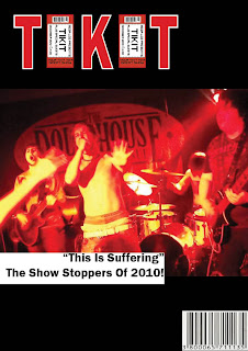
| This is the final version of my second cover, which I will be using as my final product. I added more subsidary images to the sell lines to make the page more interesting for the consumer. I also took inspiration from 'Q' magazine and used a plus sign to point out more factors included in the magazine. I am much more comfortable with using this version of my cover, as I feel it is more conventional and generally looks more appealing. |
 |
| Here, I added a subsidary image to the bottom of my page, acting as a poster that can be found inside the magazine. I also added a banner to the bottom to explain the image to the reader. |
 |
| Here, I added a banner to the top of my page to try and conform to the layouts of other magazines. I also added a competition reference to expand what could be inside the magazine, and to make the best of the avaliable space. |
 |
| I decided the black background was too harsh for my cover, so decided to fade it, and lighten it up slightly. I also added another sell line and tried to decide where would be best to place other ones. |
 | |
| After looking at my first attempt of my Music Magazine Cover, I decided to make it a more conventional piece by changing key elements to make it more like a traditional magazine. My masthead, I thought, was too outrageous in terms of its placement and delivery, so i used the design to make a more regular masthead, using the original image as the letter 'I', as not to waste it. I changed the main image to one where more of the band is visable, to give a clearer understanding of the purpose of the image. I changed the background colour to something I could more easily adapt to and change throughout the editing process, and I played around with ideas for the presentation of the sell lines. |